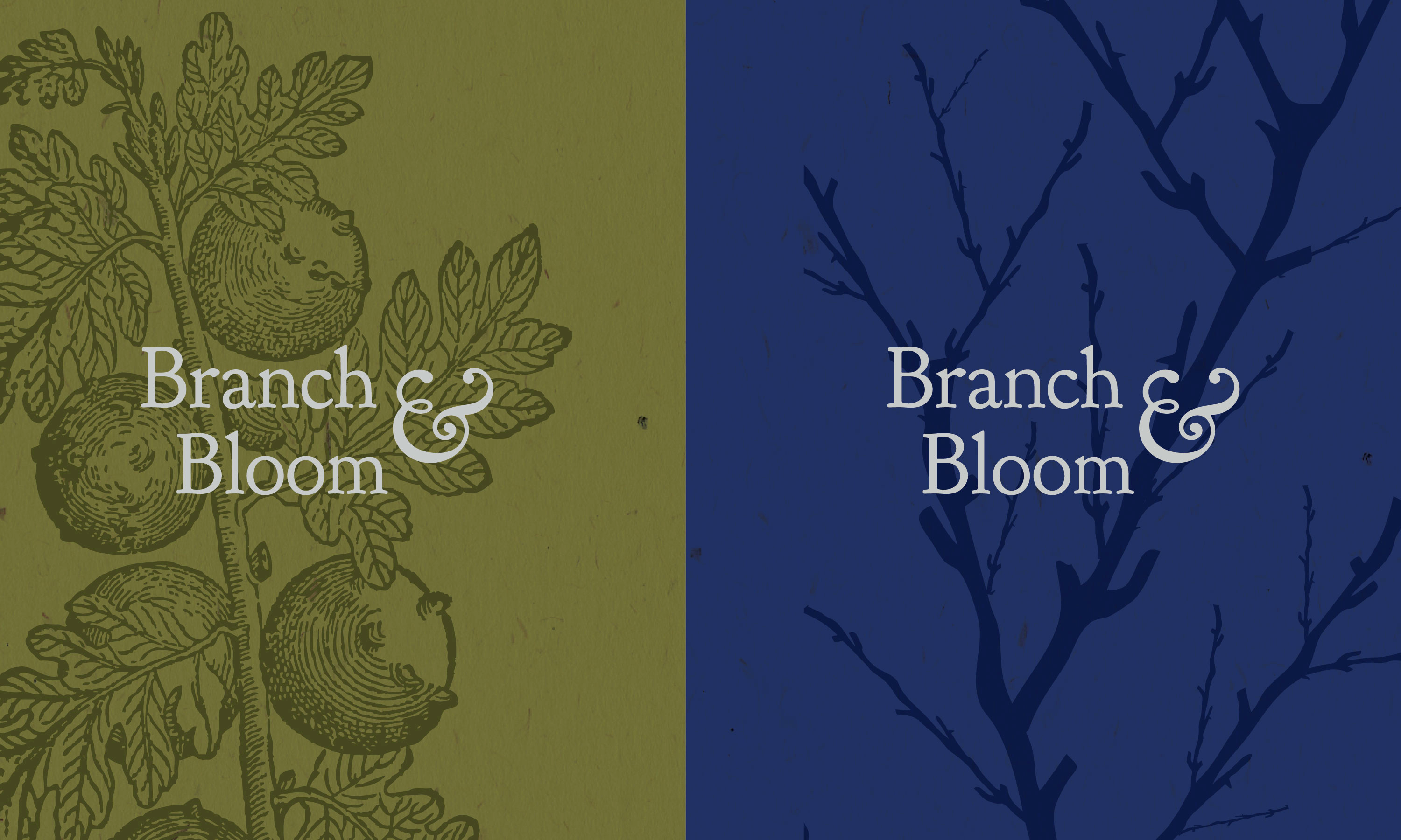
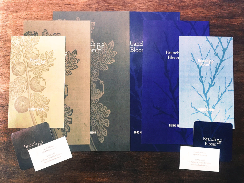
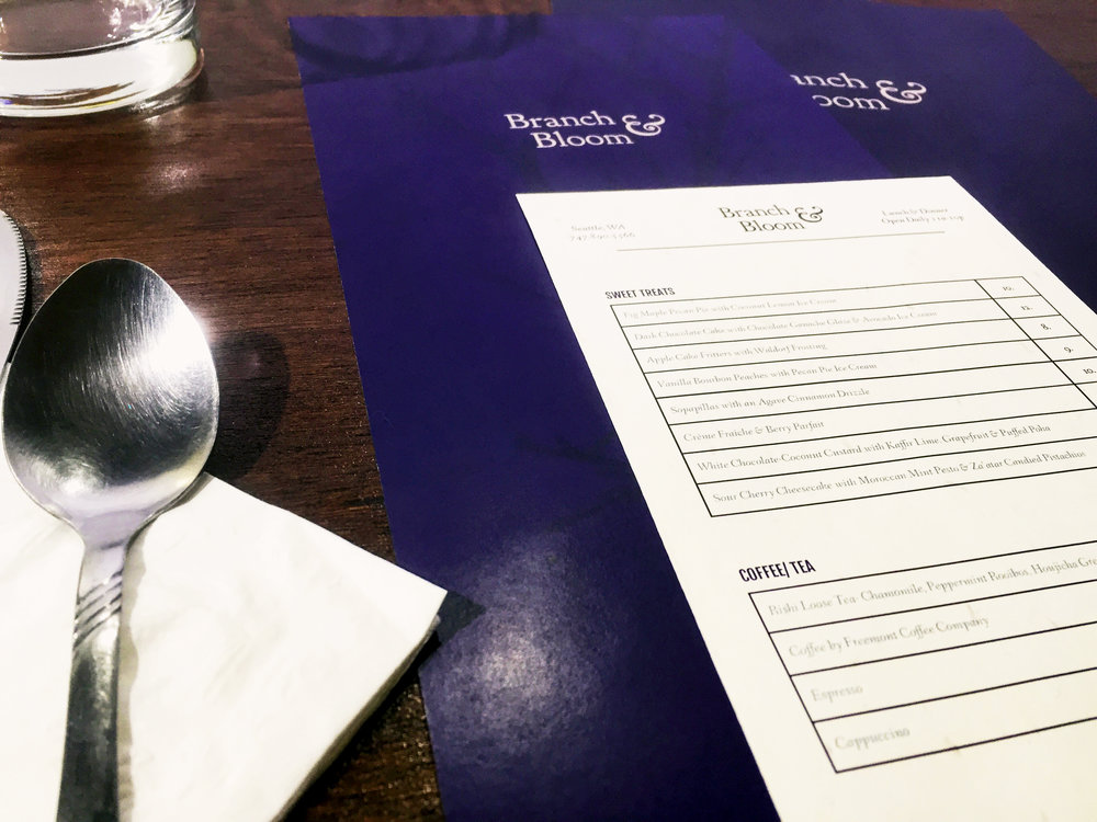
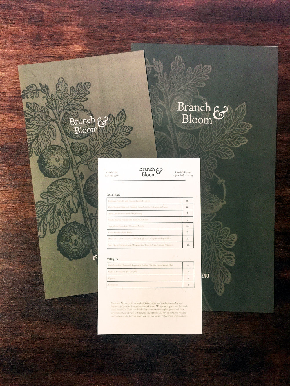
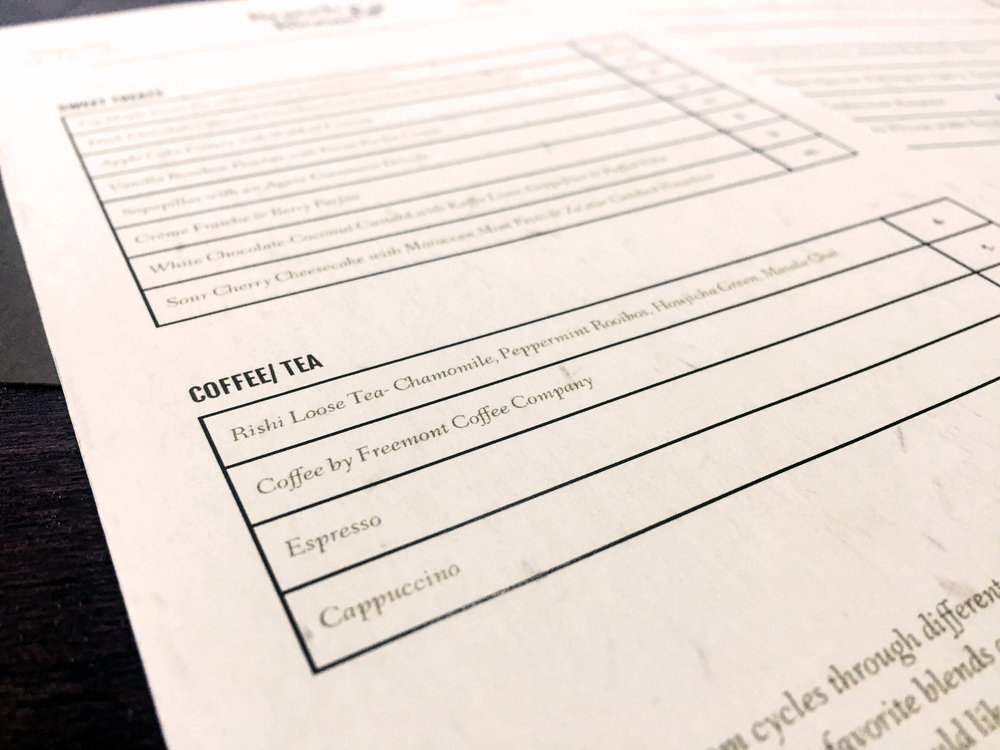
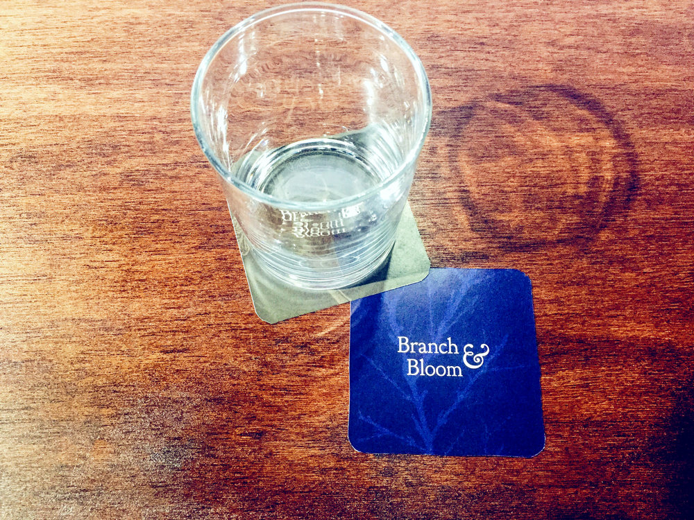
The concept for the branding directly correlates to the premise behind the restaurant- a focus on season fresh foods. The visual design for Branch & Bloom is minimal, clean, simple and elegant. The logo is comprised of a large decorative ampersand and a serif typeface to convey elegance. The color palette is cool and serves two distinct menu switches- blue and grey for Fall and Winter (Branch), and green and light green for Spring and Summer (Bloom). Dependent on the season of the year, the restaurant decorations and materials like menus and drink coasters feature their respective colors and botanical illustrations.
Branch & Bloom